By: Andrew Cottingham
University of Evansville Alumni (2022)
Date: March 12th, 2025
Equality and freedom, two fundamental principles enshrined in the Declaration of Independence and the U.S. Constitution, have been on a steady decline in the United States since 1776, especially during the 20th and 21st century in the aftermath of World War Two. In order to recognize said decline, one must first understand how to measure it and chart it. In this article, we will not only define how to measure both equality and freedom in the United States, but we will also chart it, analyze it, and draw conclusions from it as well.
The methodologies used to measure and map equality and freedom, and the political concepts found within this article, were developed by my friend Lloyd Sloan, who I have written about in my previous works on this topic. My purpose is to further expand upon his initial research, which can be accomplished by studying the original concept, updating and building upon it, and by correlating it with the data we have collected in our studies of the Equality-Freedom Model. In doing so, we can accurately define the direction in which the country is currently heading in, and we can define the direction in which the country should be heading instead.
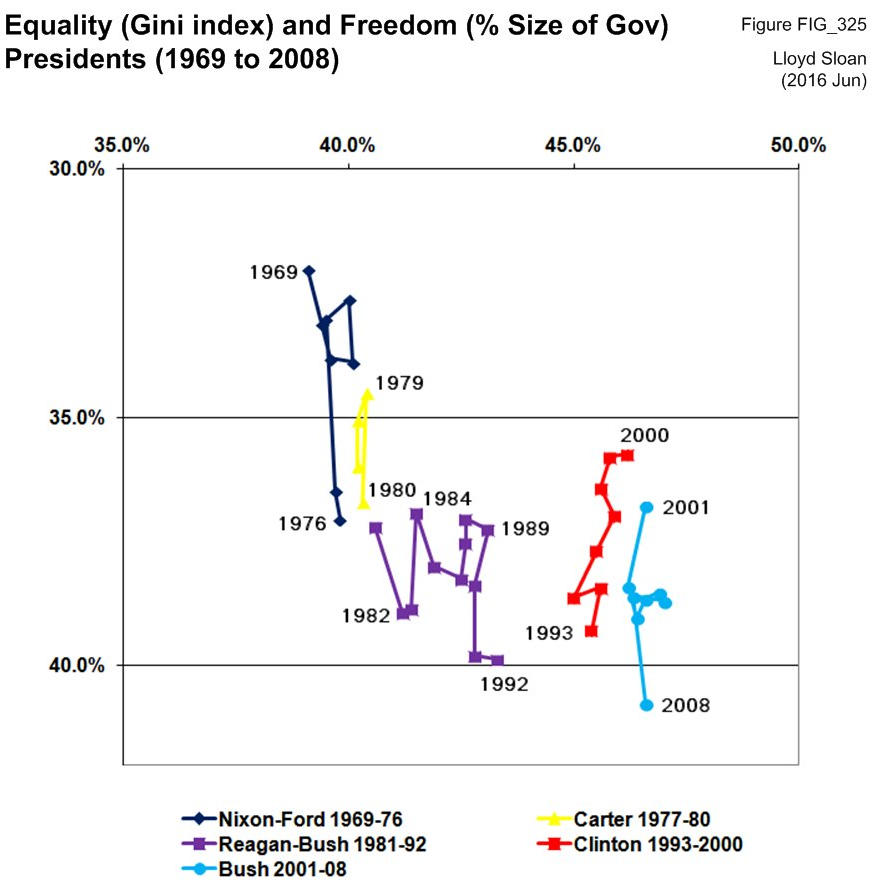
Original 2016 Chart (1969-2008):
The initial chart (above), created by CULP Founder Lloyd Sloan in 2016, demonstrates how the Gini Index and federal spending, specifically as percentage of GDP, have fluctuated in the United States between 1969 and 2008. Sloan also separates the timeline by representing each presidential administration from President Nixon starting in 1969 and ending with President George W. Bush at the end of his second term in 2008. In this chart, Sloan utilizes the Gini Index as a measurement of equality (x-axis), specifically wealth inequality, in the United States. Sloan also utilizes federal spending as percentage of GDP as a measurement of freedom (y-axis) in the United States.
Note that both variables can have either a positive or negative relationship with their respected label; for example, as the Gini Index decreases and moves from right to left on the x-axis, then equality increases. If federal spending as a percentage of GDP decreases and moves up on the y-axis, then freedom also increases. As a result, the more the graph shifts upwards and to the left, the freer and more equal the United States becomes.
On the contrary, if the Gini Index increases, moving left to right on the x-axis, equality decreases; additionally, if federal spending as a percentage of GDP increases, moving down on the y-axis, freedom also decreases. As a result, the more the graph shifts downwards and to the right, the less free and equal the United States becomes.
By plotting a point (equality, freedom) for each year, one can create a timeline that can reveal the direction of the country over a period of time, which we can then utilize to analyze the decline of equality and freedom in the United States. Once the initial timeline is established, it can then be analyzed by considering several political and non-political factors. These factors include but are not limited to differing Presidential administrations, party control over Congress, election years, economic downturn (recessions & depressions), market crashes, conflict (domestic & abroad), etc. This topic will be explored in greater detail in the next section.
To sum up Sloan’s initial 2016 chart, it shows that both equality and freedom in the United States have certainly been in decline since 1969 under both Republican and Democratic administrations. In fact, according to this chart, the American people were more equal in wealth and freer in 1969 than in 2008. Overall, this timeline proves that the general direction of the country between 1969 and 2008, a period of almost 40 years, shifted downwards and to the right.

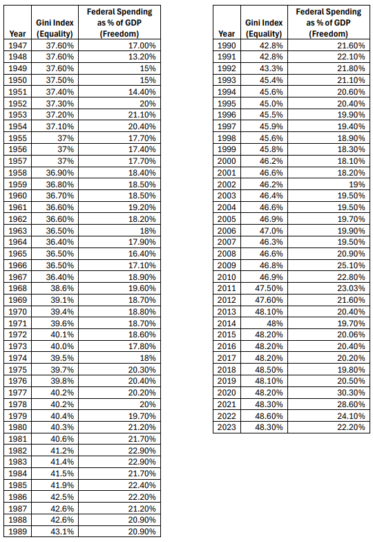
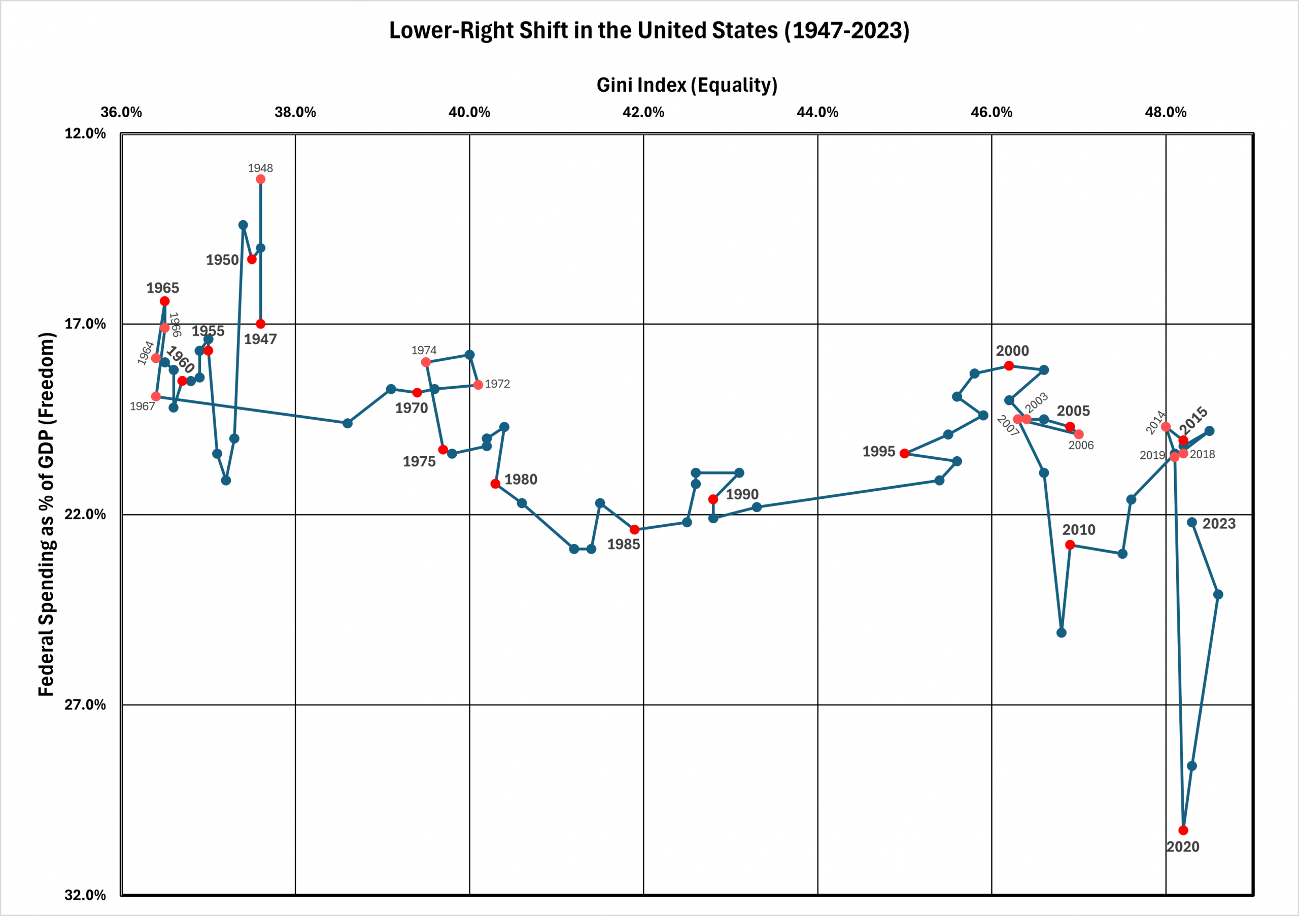
Updated 2025 Chart (1947-2023):
Since 2016, when Sloan’s initial chart was created, it has required recent updates to the data set, which I updated last month and compiled into this new chart (above). Not only did I decide to update the data to include the Gini Index and federal spending as percentage of GDP from 2009-2023, but I also took it a step further and included the data from 1947-1968 as well. While the addition of the data from the Obama, Trump, and Biden administrations was essential for modern analysis, I also chose to include the administrations of President Truman, Eisenhower, Kennedy, and Johnson for historical analysis. By expanding the timeline, one can further analyze the decline of equality and freedom in the United States since World War II, which this graph and its predecessor both accurately map.
Notable Events
- Post-WWII U.S. Production Adjustment (1947-49)
- Korean War (1950-1953)
- Vietnam War (1955-1975)
- Recession (1973-1975)
- Recession (1980-1982)
- Gulf War & Recession (1990-1991)
- 9/11 & War on Terror (2001)
- Iraq War (2003-2011)
- The Great Recession (2007-2009)
- COVID-19 Pandemic (2019-2023)
As mentioned in the previous section, the general direction of the country displayed in this updated timeline has continued to shift downwards and to the right. When comparing the two charts, one can immediately find that the charts are identical between 1969-2008, and that is due to the fact that they use the same data as expected. Additional insight can be found outside of that 39-year window; for example, from 1947-1967, in just 20 years, the country actually shifted downwards and to the left rather gradually. This was quite surprising to discover. Based on the timeline, the downward shift to the right must have started again after 1967. Another notable period is between 2007-2009, which was the Great Recession, where we saw a significant downward shift to the right; however, this would later be overshadowed by the COVID-19 pandemic. During the COVID-19 pandemic, which started in late 2019 and ended in 2023, the United States experienced the greatest loss of equality and freedom since World War Two. During this period, we witnessed an incredible amount of wealth shift from the bottom to the top alongside a significant increase in both government spending, regulation, and overreach.
Additional Support for the E-F Model:
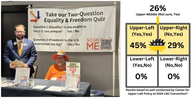
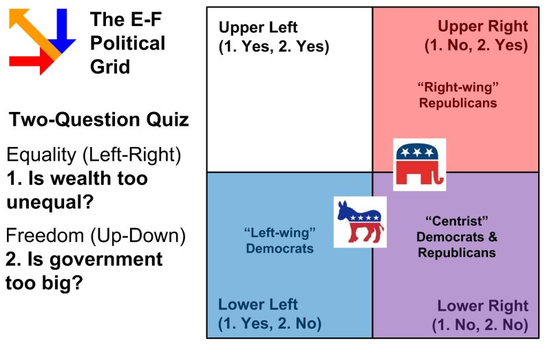
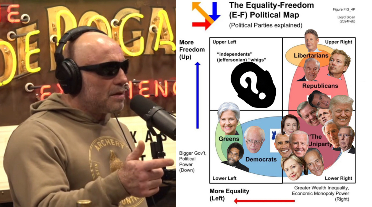
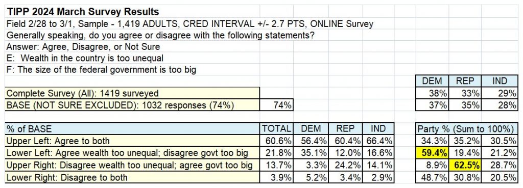
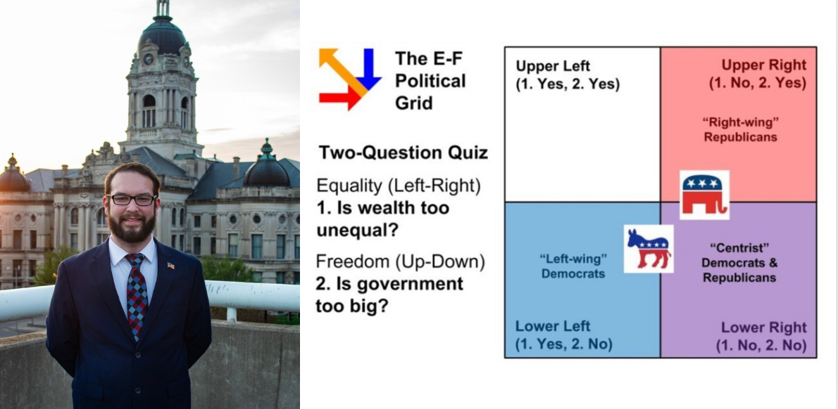
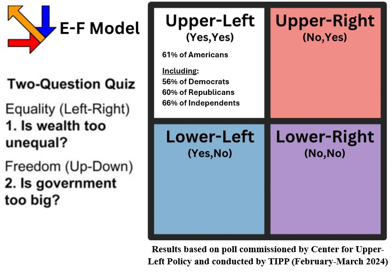
In previous articles, I have written about the Equality-Freedom Model (Figure 3), a new political map also created by Lloyd Sloan. Since being introduced to the concept, I have assisted Lloyd in updating old data, gathering new data, and gaining additional insight into his original concepts. To sum up the E-F Model, it is a two-dimensional political grid that is separated into four quadrants labeled Upper-Left, Upper-Right, Lower-Left, and Lower-Right, which are shown above. Which quadrant a person is placed in is solely determined by how they answer these two fundamental questions relating to equality and freedom. 1) Is wealth too unequal? 2) Is the government too big?
For more in-depth analysis of the E-F Model, please consider reading these articles below:
- “Young Political Scientist Helps Build Case for New Political Map with TIPP Poll Results”
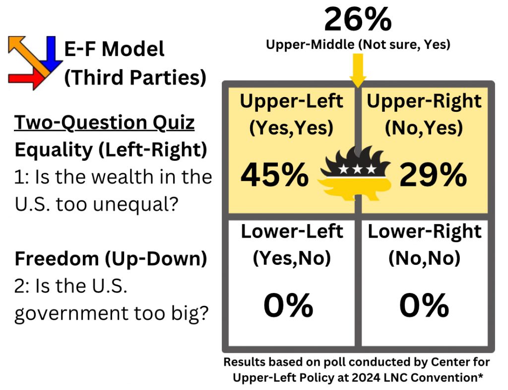
- “Center for Upper-Left Policy Finds Left/Right Divide Amongst Libertarians at 2024 LNC”
Having gathered and analyzed polling data from Democrats, Republicans, and Independents (Figure 3), and Libertarians (Figure 4) throughout 2024, we recognized that updating the timeline was our next objective as we wait for our poll with the Green Party to conclude. As valuable as our polling data is for supporting the merit of the E-F Model and the insight gained from it, we also recognized that updating the timeline was also essential, for it is additional supporting evidence for the E-F Model. Afterall, the timeline clearly shows that the country is heading in a Lower-Right direction, which is explained by the E-F Model. Lower-Right means greater wealth inequality and more government, which means less freedom. Meanwhile, the E-F Model and the data supporting it suggests which direction the American people want to take the country in an Upper-Left direction. Upper-Left means greater equality and less government, which means more freedom. It turns out that direction crosses all party lines except for the uniparty, which aligns itself in the Lower-Right. Once we can define and recognize which direction we have been heading, we can then decide how we want to change our course moving forward.
A New Direction for the Country:
In conclusion, the decline of both equality and freedom in the United States since can be accurately mapped, analyzed, and defined by the data within these two charts, which also support the insights initially made through the E-F Model. Not only do these charts prove that the United States has been heading in a downward direction to the right (Lower-Right), but they can also help us further understand why the country has been heading in that direction on a contemporary and historical level of analysis.
Additionally, both of these charts and the E-F Model also provide us with a new direction to take the country in, which is in an upward direction to the left (Upper-Left). This direction emphasizes an approach to shrinking government as a means to increase freedom, but in a way that also decreases wealth inequality; therefore, reversing the decline of both equality and freedom in the United States. Of course, this just scratches the surface of the concept, for the true task at hand will be drafting policies for doing so and implementing them throughout our local, state, and federal government.
Sources:
1. Federal Reserve Economic Data (FRED)
FRED offers Gini Index values for the U.S. from 1967 to recent years, with consistent annual data updated by the World Bank and other sources. (Fred Gini Index Series)
2. Our World in Data
This platform provides historical data visualizations and datasets on economic inequality, including income distribution and Gini coefficients, covering various decades. (Our World in Data)
3. Scholarly Estimates for Early Years (1947-1963)
Since official annual Gini Index data before 1967 is sparse, estimates for 1947–1963 are derived from historical economic studies and reconstructions of income inequality trends in the post-WWII era.
• Primary Study: Goldin, Claudia, and Katz, Lawrence. “The Shaping of Postwar Income Distribution in the United States.”
• Secondary Source: Piketty, Thomas, and Saez, Emmanuel. “Income Inequality in the United States, 1913–1998.”
4. U.S. Census Bureau
The Census Bureau provides historical Gini Index data for households and families starting from 1947. Their reports cover trends in income inequality and offer annual Gini estimates based on family income. (US Census Bureau Gini Index Tables 2010-2023)
5. U.S. Federal Spending as % of GDP (1947-2023)
•Secondary Source: https://www.usgovernmentspending.com
Data Set for Updated Chart